WHERE COMMUNITY MEETS CREATIVITY


11 W. KING ST.
LANCASTER PENNA.
LANCASTER PENNA.


Our brand refresh for Wyndridge Farm brings a farm-fresh feel to the packaging, inspired by its rich agricultural heritage. We used natural textures and hand-rendered typography to reflect the simplicity and authenticity of farm life. Fresh, earthy colors highlight the farm’s natural beauty, creating an inviting, sustainable look that connects each product back to its origins.
CUSTOM ILLUSTRATION PACKAGE DESIGN BRAND SUPPORT APARREL DESIGN
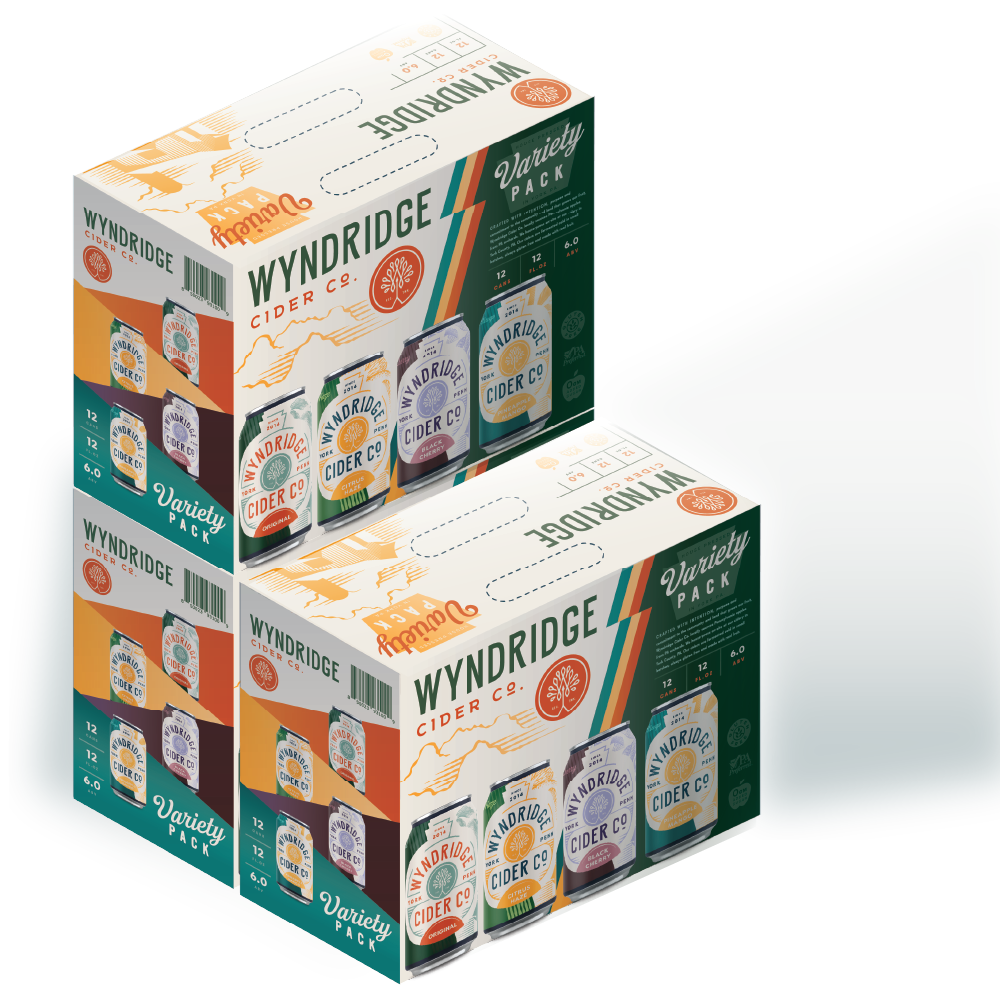


Our brand refresh for Wyndridge Farm is a celebration of its rich agricultural heritage, bringing a farm-fresh feel to every package. Inspired by the rolling hills and expansive orchards of the farm, we crafted designs that evoke the authenticity and craftsmanship rooted in Wyndridge’s legacy. Through thoughtful use of texture, natural elements, and hand-rendered typography, the packaging reflects the simplicity and purity of life on the farm—connecting each product to its origins in a way that’s both nostalgic and refreshingly modern.

We introduced a vibrant color palette inspired by the changing seasons at Wyndridge, using fresh, earthy tones that highlight the natural beauty of the farm. Soft greens, sun-soaked yellows, and rich orchard reds breathe life into the packaging, creating an inviting visual experience that mirrors the landscape. This thoughtful use of color not only enhances shelf presence but also reinforces the connection to the farm’s commitment to quality and sustainability, making each bottle and can feel like a true taste of the countryside.


11 West King St
Lancaster, PA 17603, USA
email@foxduck.com


© Foxduck 2025